Typography is much stronger in branding that most individuals can imagine. It is not only a question of choosing a stylish font or making the text beautiful, but rather about the way in which people feel upon seeing your brand. Typography is a non-verbal agent. It predetermines the mood, conveys values and can make customers willing to trust you or not. All the curves, all the lines, all the fonts have a sense. This is all the more significant in Pakistan due to the cultural attachment people in this country experience to their national language Urdu. Urdu is not only a means of communication, but also the language of poetry, traditions and identity. Urdu typography is more than just offering words in a beautiful script when the brands do it, it is routing into a sense of pride, belonging, and emotional closeness. It informs the customers that the brand knows their origins and that it speaks their language-both literally and culturally. In the case of startups, an attractive solution is the Urdu typography that will make an instant impact and will ensure that an individual is perceived as approachable in a competitive market.
In the case of well established companies, it may help renew their image and make customers remember that they still associate themselves with local values. The elegant and flowing style of Urdu fonts and styles can make a basic communication more memorable and more heartfelt. It might be a slogan that a person remembers or a product name or a social media initiative, Urdu typography can help a brand look and feel natural, reliable, and familiar in a way that the bare fonts in English can sometimes fail to do.
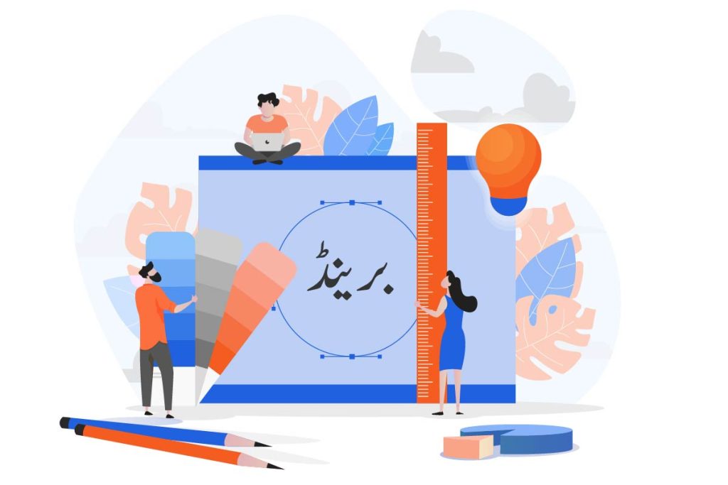
Why Urdu Typography Matters in Branding
Typography in branding is not only a design, but a powerful instrument that creates perception, trust and emotionally relates. The practice of Urdu typography is special in the context of Pakistan since Urdu is not just a national language but also a cultural icon as well. Why is Urdu typography so important:
Cultural Connection
Urdu is connected to the history, art and day to day activities of Pakistan. Urdu has never been deprived of its tradition and collective memory, since the times of classical poetry by Ghalib and Iqbal, or the scripts of dramas and songs. When a brand is written in Urdu typography, it is not only writing words, but it is accessing some common identity.
Example:
The brand uses Urdu calligraphy to come up with a logo or a slogan during Independence Day campaigns. The Nastaliq styles of writing Pakistan Zindabad seem to be patriotic and emotionally motivating when compared to simple texts in the English language.
Why it Matters:
The customers perceive the brand as not a foreign entity seeking to integrate into them but rather one of us.
Comparison Table – Cultural Impact
| Branding Style | Customer Perception |
|---|---|
| English-only slogan | Feels global and modern. But slightly distant |
| Urdu-only slogan | Feels local, cultural and rooted in identity |
| Bilingual slogan | Balanced. Modern yet still relatable |
Emotional Impact
The Urdu script is elegant and soft in nature, which is why it is instinctively emotional and poetic. The appearance is fluid and combine strokes of a brush and it is this artistic aesthetic that enables the brands to convey the messages in a more personal and warmer way than cold blocky fonts of English.
For Example:
The Surf Excel advertisement “Daagh Toh Achay Hotay Hain” written in Urdu is a advertising almost like a piece of advice given by a parent. By translating it to English, it would have sounded flat and would have lost its emotional appeal.
Psychological Impact:
Urdu typography is similar to handwriting and it unconsciously makes one think that they are being addressed, but not being sold something.
Why Urdu Works Emotionally?
- Elegant Flow: Looks artistic and human.
- Warmth: Connects with feelings of home, tradition, and care.
- Flexibility: Can be joyful or serious to the same extent.
Inclusivity
Pakistan is a multicultural nation and there are people of various educational and social backgrounds. Though English is a common language in the urban areas, it is not the language of all people-mostly the rural population or the aged ones. Brands can reach out to all and communicate the message of inclusivity by relying on Urdu typography.
Example:
The Telecom brands such as Ufone and Jazz usually conduct national campaigns in Urdu typography that their advertisements are easily comprehended and believed in even in distant villages.
Why it Matters:
When individuals perceive the language in a clear manner, they will feel respected and valued by the brand.
Inclusivity Across Audience Segments
| Audience Group | Comfort with English | Urdu Typography Impact |
|---|---|---|
| Urban youth | Medium to High | Adds cultural and emotional relatability |
| Rural communities | Low | Ensures clear understanding and trust |
| Older generations | Low | Feels natural, friendly, and respectful |
In short, Urdu typography is not just a font choice. It is a bridge that connects brands with culture, emotions, and inclusivity. By adopting it, companies can make their messages feel authentic, trustworthy and close to the hearts of their customers.
Ways Urdu Typography Makes a Brand Relatable
Builds Trust and Familiarity
Brands that use Urdu typography show they understand local values. For example:
Strengthens Emotional Branding
Urdu fonts carry an artistic touch. A brand message written in Nastaliq or Kufic style can make ads feel more heartfelt and appealing compared to plain English fonts.
Helps in Rural and Local Market Reach
In small towns and rural areas, Urdu is more easily understood. A product label or billboard in Urdu typography ensures that your message reaches everyone, not just the urban elite.
Creates a Unique Brand Identity
Many brands use the same English fonts, making them look similar. Urdu typography, on the other hand, helps brands stand out with a unique local identity.
Best Practices for Using Urdu Typography in Branding
Using Urdu typography effectively requires careful thought. It’s not just about writing text in Urdu. It’s about choosing the right style, context and tone so that your brand looks professional, relatable, and consistent. Here are the most important best practices you can follow.
Choose the Right Font Style
Urdu typography comes in different styles. Each style gives a different personality to your brand. Picking the right one for your branding makes your message more powerful.
Nastaliq
Naskh
Modern Calligraphy Blends
Font Style Selection for Branding
| Font Style | Personality it Gives | Best Used For |
|---|---|---|
| Nastaliq | Emotional, artistic, cultural | Ads, slogans, billboards, social campaigns |
| Naskh | Clear, simple, practical | Packaging, manuals, instructions |
| Modern blends | Trendy, stylish, youthful | Logos, fashion brands, digital posts |
Balance Urdu with English
A smart mix of Urdu and English can make your brand look both modern and relatable. Urdu adds culture, while English gives a global, professional touch.
How to apply this balance?
Keep Readability in Mind
Sometimes brands over-decorate Urdu typography with swirls and heavy calligraphy. While it looks artistic, it may become difficult to read, especially from a distance.
Tips for readability:
Example:
A billboard slogan should be simple Nastaliq or bold Naskh, not heavy calligraphy that takes effort to read while driving past.
Use Culturally Relevant Words
Words matter as much as the font. Using simple, familiar Urdu words makes your message warmer and easier to connect with. People instantly recognize and relate to them.
Examples of powerful Urdu words in branding:
Why it works:
These words are short, sweet, and emotionally loaded. Customers not only read them but also feel them.
Quick Tips to Add Urdu Typography to Your Branding
- Add an Urdu tagline beneath your English logo.
- Use Urdu in festive campaigns (Eid, Independence Day, etc.).
- Print packaging details in both Urdu and English.
- Create social media posts with catchy Urdu quotes.
Final Words
Urdu typography is more than just design. It’s about speaking the language of your people. It makes your brand feel relatable, emotional, and culturally rooted. By blending Urdu typography into your logos, ads, and packaging, you show customers that you value their identity and traditions. In today’s competitive market, a touch of Urdu can give your brand the unique edge it needs to stay memorable and trustworthy.
